
Munni UI
case study
Munni UI
case study
MUNNI UI CASE STUDY
Overview:
As part of my Professional Certificate in UI Design with the UX institute, I was tasked with designing 3 different responsive screens for a challenger bank.
Problem:
Creating a responsive set of UI designs for a challenger bank based around the keywords Trustworthy, Clear and Playful. Included is the design of the brand as a whole.
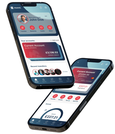
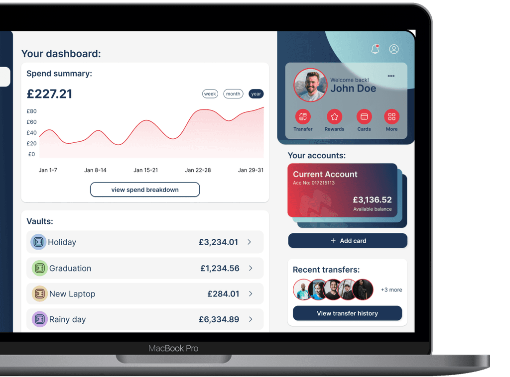
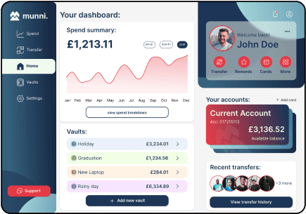
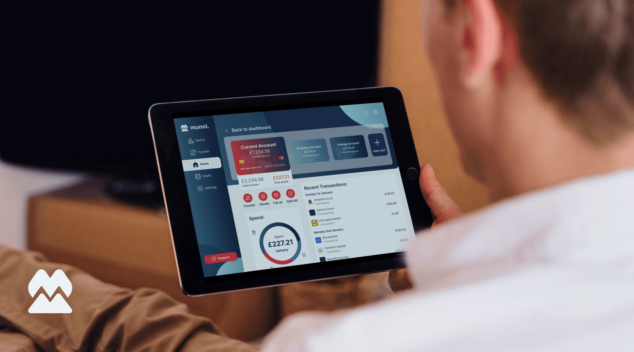
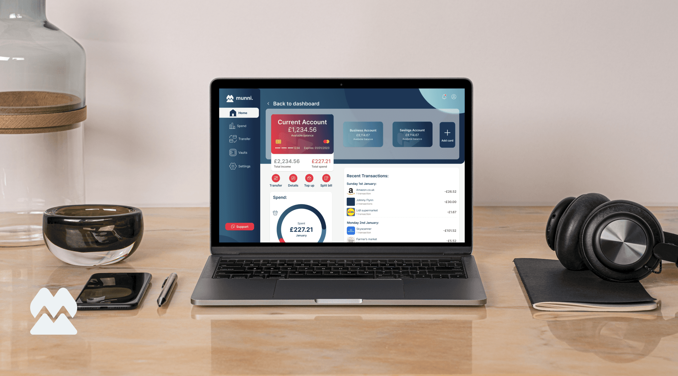
Solution:
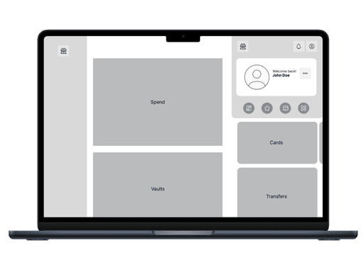
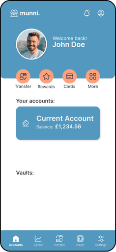
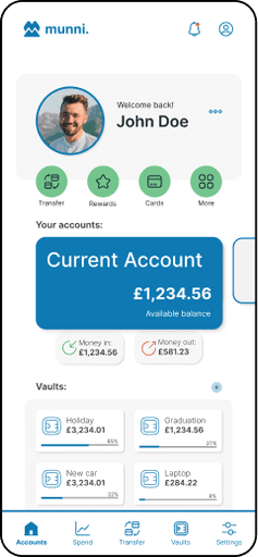
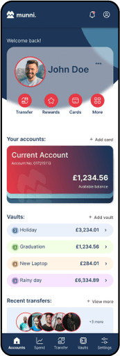
A set of 9 screens with a clean and playful UI design, navigating from mobile, to tablet and then to desktop. Optimising the design to be able to show as much information as possible with minimal need to scroll or change screens.
Process:
My process entering this project was to keep things simple, as I was just learning the ropes in UI Design.
My aim was to complete the following:
Moodboard
Wireframes
Style Guide
Design and Iterate
Mood Board:
A visualisation tool to get me thinking about my design process and collate reference of UI that works (and doesn’t). This allowed my to free up my mind whilst having a goal in mind.

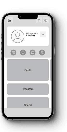
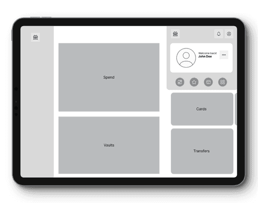
Wireframes:
Utilising wireframes helped to solidify my design thinking whilst forcing me to think actively about data visualisation and how all the separate elements of the design could work together.
Design & Iteration:
Design doesn’t happen in a vacuum, so I had various rounds of iteration based on feedback from professors and classmates, looking to learn to receive feedback and apply it to my work.


Lessons Learned:
I have learned the process of UI design, from concept, to moodboards and wireframes to mock up. I have gained a proficiency with Figma, being able to create components (and variants) and use Auto-layout to help streamline my design flow.I have also gained an understanding into the design process, iterating and adjusting my designs based upon feedback received.
Back to UI/UX Design
All rights reserved. Designs by LBK Draws.
Overview:
As part of my Professional Certificate in UI Design with the UX institute, I was tasked with designing 3 different responsive screens for a challenger bank.
Problem:
Creating a responsive set of UI designs for a challenger bank based around the keywords Trustworthy, Clear and Playful. Included is the design of the brand as a whole.
Solution:
A set of 9 screens with a clean and playful UI design, navigating from mobile, to tablet and then to desktop. Optimising the design to be able to show as much information as possible with minimal need to scroll or change screens.
Process:
My process entering this project was to keep things simple, as I was just learning the ropes in UI Design.
My aim was to complete the following:
Moodboard
Wireframes
Style Guide
Design and Iterate
Mood Board:
A visualisation tool to get me thinking about my design process and collate reference of UI that works (and doesn’t). This allowed my to free up my mind whilst having a goal in mind.
Wireframes:
Utilising wireframes helped to solidify my design thinking whilst forcing me to think actively about data visualisation and how all the separate elements of the design could work together.
Design & Iteration:
Design doesn’t happen in a vacuum, so I had various rounds of iteration based on feedback from professors and classmates, looking to learn to receive feedback and apply it to my work.


Lessons Learned:
I have learned the process of UI design, from concept, to moodboards and wireframes to mock up. I have gained a proficiency with Figma, being able to create components (and variants) and use Auto-layout to help streamline my design flow.I have also gained an understanding into the design process, iterating and adjusting my designs based upon feedback received.
Back to UI/UX Design
All rights reserved. Designs by LBK Draws.