
Scopes & Constraints:
This project requires that the app is a user friendly base of information that anyone can use, tackling the problem statement provided by the transport agency:
The app must show the ETA of all buses that are due to arrive at any given at a particular bus stop.
As with any project, time and cost were major constraints. All user research had to be conducted at as low a cost as possible, free software was used wherever possible.
For this project, we were given a time frame of 3 weeks to complete.
Roles & Responsibilities:
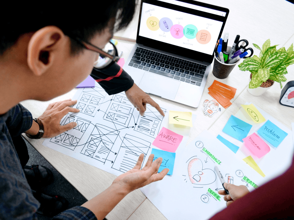
I was the UX designer for this project, it was my responsibility to understand the brief, create user flows, personas and competitive analyses of apps that have found success in the sector already.
Based upon these sets of information, I was then tasked with the user research. I designed and distributed the user surveys, analysed the data and conducted interviews to better understand our user market.
After this analysis I created lo-fi wireframes which turned to hi-fi mockups ready to present to the client.
All this was undertaken with both end user and business goals in mind.
Users & Target Audience:
This app must be designed to facilitate all bus users. For this project, we decided on an age range of 18-65, to give us a broad spectrum of potential use cases with the potential for a diverse range of experiences.
Problem:
Due to expansion, numerous bus routes have been recently added. Many of those routes stop at the same bus stop. Riders want to know when the next bus will arrive at each stop. They also want to know how much time they have to get to the bus stop.
Overview:
The brief was to design and create hi-fidelity mock ups for a midsize metropolitan transportation agency as an alternative way to access their travel information. Currently they post their bus times physically at each bus stop and online through their website.
Process:
As an introduction into the UX Process through the bootcamp, I was given the following process:
User Flow Diagram
User Persona
Sketching ideas
Wireframes
Style Guide
Design and Iterate
Wireframes:
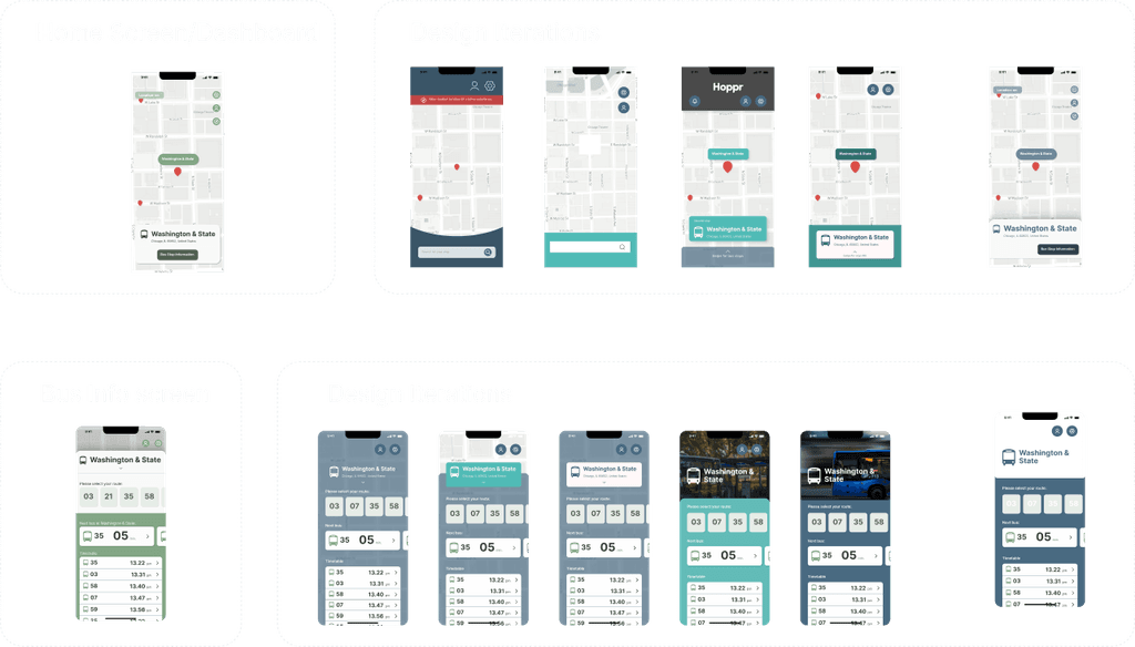
The next phase began the design iterations. Starting hand sketched wireframes, these were relatively lo-fi, aimed to flesh out ideas forming in my head and to weed out any potential pain points within my initial User flows. From here I would update my User flows to reflect the required changes.
Once I was happy with the User flows and the initial sketches I moved on to a digital wireframe, more mid-fi to give a better representation of design, without being tied down to a version


Lessons Learned:
I learned a good deal about the overall UX Process, what parts there are to play before the design phase can even happen. This project also allowed me to understand the subtle differences in the UX role, and that there can be specialist parts to a UX/UI Designer.

Competitor Analysis:
Next up I created SWOT analyses of 3 competitor apps which fulfils the same primary function as our app. From this, we aimed to learn more about what does and doesn’t work, and using this benchmarking in our design process.

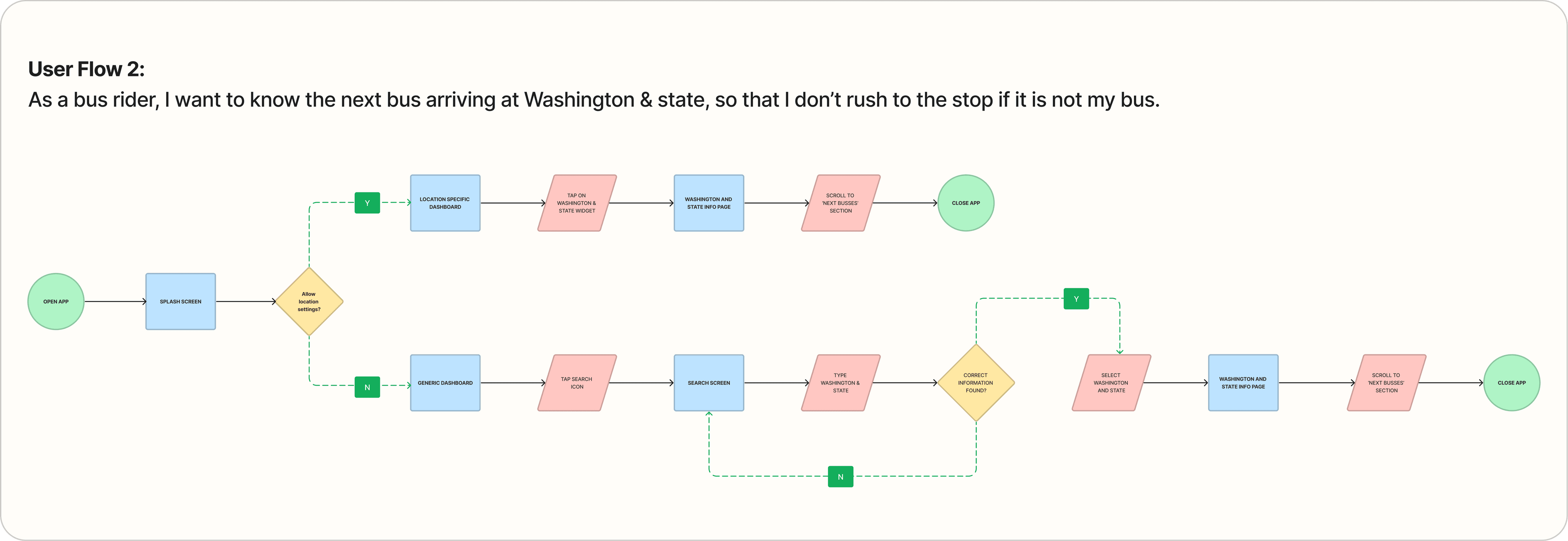
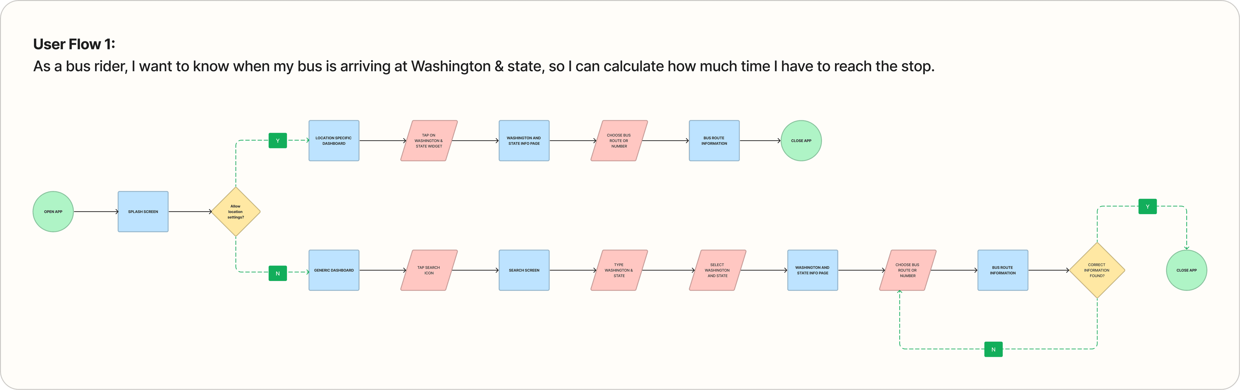
User Flow Diagram:
After the user surveys and interviews were conducted, I was able to create User flow diagrams to help initiate the design thinking process. The goal here was to answer three basic questions as a potential user:
As a bus rider, I want to know when my bus is arriving at Washington & state, so I can calculate how much time I have to reach the stop.
As a bus rider, I want to know the next bus arriving at Washington & state, so that I don’t rush to the stop if it is not my bus.
As a bus rider, I want the ability to view future arrival times for any of the 7 bus lines at Washington & state, so that I know when my bus arrives.
From this I had the basis to begin page construction, as the basic user flow gives me an MVP to work with.
Expansion can come later, as and when needed.


Style Guide:
Next, the style guide that would help me with my consistency in my aesthetic endeavours. I kept this simple and avoided unnecessary details.

Design & Iteration:
The high-fidelity mock ups came next, with numerous iterations and explorations of what worked, what didn’t and what had the potential to change the course of the design process. Using all the result of the research, I set out to create a usable and empathetic app design that was accessible and aesthetically pleasing.
User Persona:
I initiated the process creating 3 user personas, fictional people who would use the app, this was before any research was undertaken and so it contains intuitive information. The personas, and all other elements, such as user flows were updated regularly throughout this project.

User Research:
I undertook some user research in the form of User Surveys, to gain a better understanding of the target market for the application and to further understand their needs.
Alongside the surveys, I contacted and conducted 3 separate interviews to further breakdown my findings. These interviews also helped me refine my User personas, giving me more direction.
The information gathered also helped me define User stories, further helping my User flow diagrams feel more authentic.
The finding from my User surveys were:
53%
of survey responses found real-time tracking the most useful feature in their bus/travel app.
59%
of survey responses only used their travel app on the day of travel.
72%
of survey responses used their apps to check real-time locations of their transport.
66%
of survey responses wanted integration with other transport services (chance to expand on baseline service).
50%
of survey responses regularly encountered scheduling issues with their current app, so accuracy is a must
Site Map:
I devised an initial Site map to help plan the pages and further establish the user flow within my own mind, from here I had the foundations of the app in word form, next would come the design phase.


Overview:
The brief was to design and create hi-fidelity mock ups for a midsize metropolitan transportation agency as an alternative way to access their travel information. Currently they post their bus times physically at each bus stop and online through their website.
Overview:
The brief was to design and create hi-fidelity mock ups for a midsize metropolitan transportation agency as an alternative way to access their travel information. Currently they post their bus times physically at each bus stop and online through their website.
Problem:
Due to expansion, numerous bus routes have been recently added. Many of those routes stop at the same bus stop. Riders want to know when the next bus will arrive at each stop. They also want to know how much time they have to get to the bus stop.
Problem:
Due to expansion, numerous bus routes have been recently added. Many of those routes stop at the same bus stop. Riders want to know when the next bus will arrive at each stop. They also want to know how much time they have to get to the bus stop.
Users & Target Audience:
This app must be designed to facilitate all bus users. For this project, we decided on an age range of 18-65, to give us a broad spectrum of potential use cases with the potential for a diverse range of experiences.
Users & Target Audience:
This app must be designed to facilitate all bus users. For this project, we decided on an age range of 18-65, to give us a broad spectrum of potential use cases with the potential for a diverse range of experiences.
Roles & Responsibilities:
I was the UX designer for this project, it was my responsibility to understand the brief, create user flows, personas and competitive analyses of apps that have found success in the sector already.
Based upon these sets of information, I was then tasked with the user research. I designed and distributed the user surveys, analysed the data and conducted interviews to better understand our user market.
After this analysis I created lo-fi wireframes which turned to hi-fi mockups ready to present to the client.
All this was undertaken with both end user and business goals in mind.
Scope & Constraints:
This project requires that the app is a user friendly base of information that anyone can use, tackling the problem statement provided by the transport agency:
The app must show the ETA of all buses that are due to arrive at any given at a particular bus stop.
As with any project, time and cost were major constraints. All user research had to be conducted at as low a cost as possible, free software was used wherever possible.
For this project, we were given a time frame of 3 weeks to complete.
Process:
As an introduction into the UX Process through the bootcamp, I was given the following process:
User Flow Diagram
User Persona
Sketching ideas
Wireframes
Style Guide
Design and Iterate
Process:
As an introduction into the UX Process through the bootcamp, I was given the following process:
User Flow Diagram
User Persona
Sketching ideas
Wireframes
Style Guide
Design and Iterate
User Persona:
I initiated the process creating 3 user personas, fictional people who would use the app, this was before any research was undertaken and so it contains intuitive information. The personas, and all other elements, such as user flows were updated regularly throughout this project.
User Persona:
I initiated the process creating 3 user personas, fictional people who would use the app, this was before any research was undertaken and so it contains intuitive information. The personas, and all other elements, such as user flows were updated regularly throughout this project.
Competitor Analysis:
Next up I created SWOT analyses of 3 competitor apps which fulfils the same primary function as our app. From this, we aimed to learn more about what does and doesn’t work, and using this benchmarking in our design process.
Competitor Analysis:
Next up I created SWOT analyses of 3 competitor apps which fulfils the same primary function as our app. From this, we aimed to learn more about what does and doesn’t work, and using this benchmarking in our design process.
User Research:
I undertook some user research in the form of User Surveys, to gain a better understanding of the target market for the application and to further understand their needs.
Alongside the surveys, I contacted and conducted 3 separate interviews to further breakdown my findings. These interviews also helped me refine my User personas, giving me more direction.
The information gathered also helped me define User stories, further helping my User flow diagrams feel more authentic.
The finding from my User surveys were:
53%
of survey responses found real-time tracking the most useful feature in their bus/travel app.
59%
of survey responses only used their travel app on the day of travel.
72%
of survey responses used their apps to check real-time locations of their transport.
66%
of survey responses wanted integration with other transport services (chance to expand on baseline service).
50%
of survey responses regularly encountered scheduling issues with their current app, so accuracy is a must
User Flow Diagram:
After the user surveys and interviews were conducted, I was able to create User flow diagrams to help initiate the design thinking process. The goal here was to answer three basic questions as a potential user:
As a bus rider, I want to know when my bus is arriving at Washington & state, so I can calculate how much time I have to reach the stop.
As a bus rider, I want to know the next bus arriving at Washington & state, so that I don’t rush to the stop if it is not my bus.
As a bus rider, I want the ability to view future arrival times for any of the 7 bus lines at Washington & state, so that I know when my bus arrives.
From this I had the basis to begin page construction, as the basic user flow gives me an MVP to work with.
Expansion can come later, as and when needed.
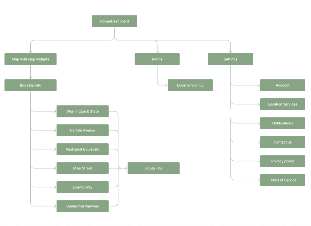
Site Map:
I devised an initial Site map to help plan the pages and further establish the user flow within my own mind, from here I had the foundations of the app in word form, next would come the design phase.
Site Map:
I devised an initial Site map to help plan the pages and further establish the user flow within my own mind, from here I had the foundations of the app in word form, next would come the design phase.
Wireframes:
The next phase began the design iterations. Starting hand sketched wireframes, these were relatively lo-fi, aimed to flesh out ideas forming in my head and to weed out any potential pain points within my initial User flows. From here I would update my User flows to reflect the required changes.
Once I was happy with the User flows and the initial sketches I moved on to a digital wireframe, more mid-fi to give a better representation of design, without being tied down to a version
Style Guide:
Next, the style guide that would help me with my consistency in my aesthetic endeavours. I kept this simple and avoided unnecessary details.
Style Guide:
Next, the style guide that would help me with my consistency in my aesthetic endeavours. I kept this simple and avoided unnecessary details.
Design & Iteration:
The high-fidelity mock ups came next, with numerous iterations and explorations of what worked, what didn’t and what had the potential to change the course of the design process. Using all the result of the research, I set out to create a usable and empathetic app design that was accessible and aesthetically pleasing.
Lessons Learned:
I learned a good deal about the overall UX Process, what parts there are to play before the design phase can even happen. This project also allowed me to understand the subtle differences in the UX role, and that there can be specialist parts to a UX/UI Designer.
Lessons Learned:
I learned a good deal about the overall UX Process, what parts there are to play before the design phase can even happen. This project also allowed me to understand the subtle differences in the UX role, and that there can be specialist parts to a UX/UI Designer.
Back to UI/UX Design
All rights reserved. Designs by LBK Draws.